A stats exercise with The Norwegian Frequency Project
My recent interview about training frequency and bro splits was hugely popular and caused quite a stir in the fitness industry. If you haven’t watched that yet, do so before reading this post, otherwise you won’t understand a word of it.
Lyle McDonald chimed in with a comment about the Norwegian Frequency Project.
Do pay close attention to the graphs for strength and size gains. There are a couple o big ouliers on both, guys who got amazing results. Everyone else was about the same and if you take out those outliers, the differences approach jack shit. It’s when you average them with that one or two big outlier data points

Note: if you have no interest in educating yourself about statistical or scientific methodology or Lyle McDonald’s critique of the Norwegian Frequency Project, you can safely skip this post, i.e. this is for the hardcore science crowd.
Lyle’s comment is typical of that of a non-scientist who has no knowledge about statistical methodology. The claim is essentially that the data is confounded by a few extreme positive outliers that confound the results of the analysis, i.e. without these outliers, the significant between-group differences in favor of the high frequency group disappear.
Let’s deconstruct this argument like a real scientist, which I did together with my assistant researcher Richie Hedderman. First, we should ask if there really are outliers. Anyone can look at a graph and point towards the highest or lowest value, but a statistician understands that is not how you identify outliers. The position of the data points on a graph is greatly influenced by the choice of the axes. If you pick small increment with many lines, it will appear as if the data points are further away from each other. So visual inspection of any graph gives a statistician nothing more than a hunch.
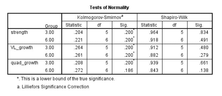
The right way to identify outliers is to evaluate a data point’s relative distance from its expected distribution. So the first step is to evaluate what kind of distribution the data has. In this case, the theoretical assumption is that the data is normally distributed. I ran Kolmogorov-Smirnov and Shapiro-Wilk’s normality tests and indeed they confirm that the assumption of normality can be maintained and parametric analyses can be used.

The next step is to identify the distance from the expected distribution for each data point. For a normal distribution, this distance should be measured in standard deviations from the mean. You should also take sample size and the type of statistical model into account, as the lower the sample size, the greater the expected deviations from theoretical distributions, so you should be more conservative with deleting data.
In general, statisticians are very wary of deleting data when there is no obvious cause for outliers, like gross measurement error or a typo made by the person that input the data, as data deletion is basically cherry picking.
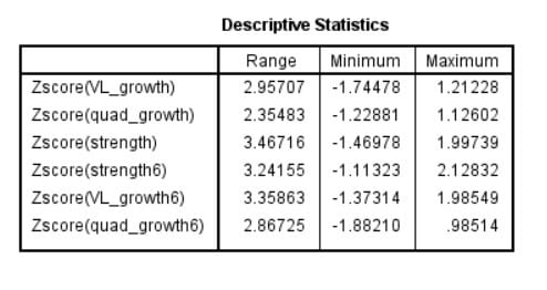
Concretely, I used the cut-off criteria from Van Selst & Jolicoeur (1994), which in our case range from 4.475 to 6.20. As you can see, in neither group did any of the data points qualify as an outlier. In fact, the highest Z-score was only 2.13, which belonged to the person that gained the most strength in the 6-day group. Even the most liberal statisticians tend to use the rule of thumb that data is only considered suspect when it’s 3 or more standard deviations from the mean. 2 SDs from the mean is perfectly normal, as in fact 95% of data points are expected to fall within that range for any normal distribution.

So we can conclude the authors from the Norwegian Frequency Project just maybe actually knew what they were doing when they didn’t delete the outliers. The lead author was Truls Raastad after all, who has a Researchgate score in the top 5% of all researchers on Researchgate, which is higher than that of Brad Schoenfeld, Alan Aragon, Bret Contreras and me.
But just to humor the idea that some genetic freaks completely confounded the analyses, we can look at some other statistics. One easy statistic is the median of both groups, which can be used instead of the average score when you want to ignore the impact of high and low values.

As you can see, the results when using median instead of mean scores are still decidedly in favor of the 6-day group.
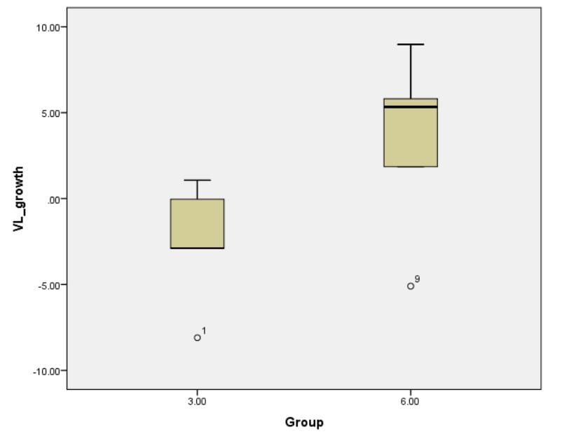
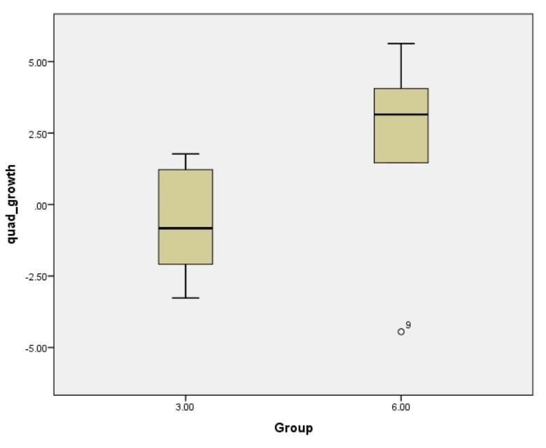
Alternatively, we can go on a data killing spree and just delete all data points that show up as potential outliers on boxplots and then rerun the analysis to see if indeed the pseudo-outliers change the results. This resulted in deleting the lowest strength gaining individual in the 3-day group, the lowest scoring individuals on Vastus Lateralis growth in both groups and the lowest scoring individual on total quad growth in the 6-day group. I’ve plotted all the values below. Note how clearly the 6-day group’s results tower above those of the 3-day group. (Also note that the closest values to becoming outliers here were in fact the low scores instead of the high scores, showing once again that visual inspection of absolute data points is misguided here and statistics are needed.)


Guess what happened? All values were still decidedly in favor of the 6-day group, as you can see in the analysis output below. The 6-day group had significantly greater gains for all 3 measures, both strength and size.

Let this be a lesson for all lay individuals that are prone to just look at averages or graphs and jump to conclusions. Not only were there no true outliers in the Norwegian Frequency Project, deleting any pseudo-outliers actually strengthened the results
 Want more content like this?
Then get our free mini-course on muscle building, fat loss and strength.
By filling in your details you consent with our privacy policy and the way we handle your personal data.
